Collector Box
#6 Daniel Buren
L’oeuvre ne peut être vue, ni comprise, ni appréhendée en soi, elle n’est que par-rapport-à et de là indéfiniment redéfinie.
L’oeuvre ne peut être vue, ni comprise, ni appréhendée en soi, elle n’est que par-rapport-à et de là indéfiniment redéfinie.
Daniel Buren est né en 1938 à Boulogne-Billancourt. Il vit et travaille in situ.
Lion d’or du Pavillon national, Biennale de Venise, 1986.
Praemium Imperiale, Japan Art Association, Tokyo, 2007.
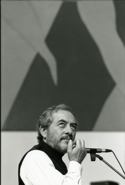
Photo-souvenir :
Daniel Buren,
Musée d’art moderne de la Ville de Paris, 1994.
© Gyula Zarand

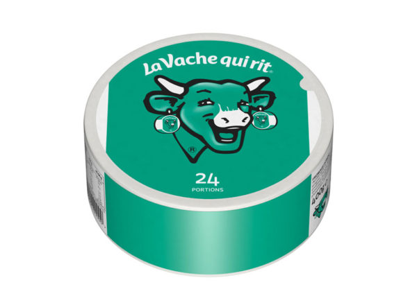
The 8.7cm-wide white or colored vertical stripes that Daniel Buren has used as a “visual tool” since 1965 are described by the artist as elements that allow for an “expansion of the field of vision” and a critical exploration of the nature of a given space, object or situation in which “mechanisms, attitudes, and systems of power are organized.” Buren “lives and works in situ”, and when he intervenes upon the boxes of The Laughing Cow® by adding a stripe of color – green, red, yellow, or blue – to the centre of the label and extending it onto the band that runs around the box’s edge, the context for his gesture encompasses the product’s visual and material design, its production and circulation, and its distribution to consumers and to the sites in which it is consumed.
Every year, over 200 million boxes of The Laughing Cow® are sold worldwide. Stacked on top of one another, they would stretch from Earth to the Moon. It was the monumental character of this industrial product that first sparked Buren’s interest, and it was ultimately this dimension upon which he chose to stake his intervention. The object’s proliferation is suggested by the mise en abîme that figures in the image of The Laughing Cow® itself: Buren borrows the stripes of color from the earrings worn by the animal that appears on each box in an update of the logo designed by illustrator Benjamin Rabier. Yet Buren’s decisive gesture consists in the use of his visual tool to organize a vertical continuity that points to the unlimited accumulation of boxes. His graphic intervention effects an immediate shift from two dimensions to three: placed one on top of another, the printed vertical stripes on the boxes form virtually infinite columns whose chromatic variations and permutations are left to the discretion of those consuming the cheese.
The addition of colored stripes further unsettles a number of important graphic elements on the packaging that are nonetheless often overlooked due to their subtlety or their limited visibility. Paying close attention to Buren’s Collector’s Edition Box, we notice for example that the bucolic landscape that usually appears in the background behind the laughing cow herself – reminiscent of the Mona Lisa – has vanished. Set on a plane of color that matches that of the portrait itself, the cow’s outline emerges all the more strongly. Elsewhere, this red coloring, to which the image owes much of its visual singularity, gives way to other shades, and the figure of the cow takes on the colour of the stripe behind it to become alternately blue, green, or yellow, troubling the recognition of the brand’s icon. Each time, the image is at once similar and different. These incongruous colors draw the gaze to the central figure, the animal at the origin of the cheese – without which the product would not exist – and to her characteristic smile, which have together come to form the brand’s global emblem.
